
Renovating Procreate’s Accessibility:
Putting an end to overly inaccessible creative applications.
Project overview:
This project focuses on improving the
usability of digital art software for creative artists worldwide by addressing issues related to complex interfaces and a general lack of accessibility. We chose to focus on Procreate, recognizing its great potential if a few key adjustments were made. As part of this case study, we interviewed and collaborated with professionals who frequently use Procreate in their creative work. Our goal evolved into streamlining workflows and making it easier for artists to adapt to various platforms by analyzing common issues and enhancing cross-platform navigation. Ultimately, we aim to support digital creators in maximizing their creative potential without being hindered by confusing software designs.
The Problem we Faced
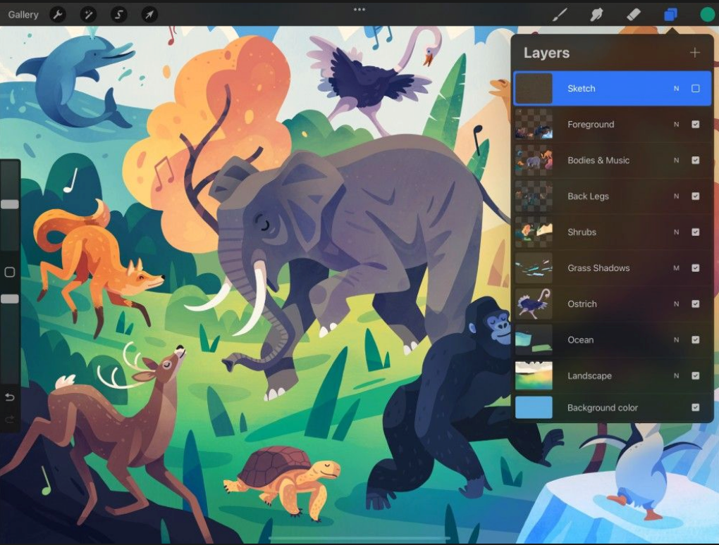
Our initial user interviews revealed that there is a severe lack of an onboarding process and help/tutorial feature in apps used by creatives. This tends to lead the average and even experienced user to feel overwhelmed by the large number of features. This uncertainty and lack of understanding of where to start lead to a disconnect. Whilst industry professionals are used to the magnitude of options, they still often forget how to access their tools promptly due to the lack of accessible tutorial-related resources within Procreate. Taking this information into account, we formulated the following problem statement:
Digital artists often experience slower workflows due to the sheer abundance of features within creative apps. There is a need for an onboarding process and tutorial-related content to help users be aware of and locate these digital tools within the app. Both new and current users struggle to find the desired tools promptly, resulting in more time spent searching for the right feature rather than being able to work on their illustration.
Discovery
We began this whole journey by discovering an issue we had all faced using creative applications. This got the wheels rolling on our process of redesigning Procreate. As stated earlier, we ran an initial set of interviews with professionals who interact with creative applications on a regular basis. Opting to ask open-ended questions, such as “What challenges do you face when using creative workspace applications?” and “How do you manage all of the information that is presented to you whilst working in your creative workspace?” This process revealed what works for certain applications and what doesn't. With the provided interviewees' information/pain points established, we were able to move forward with the redesign.
Baby Steps
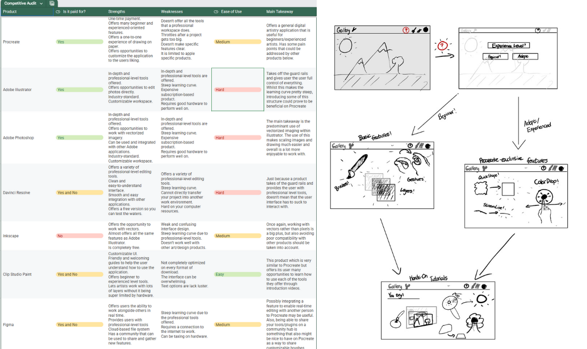
The next steps were simple yet crucial to the development of our redesign. I researched other products that our interviewees mentioned as being useful in the professional world and created a competitive audit. We then developed a user persona to better understand our target audience, along with initial sketches exploring potential redesign directions we could take.
Framework
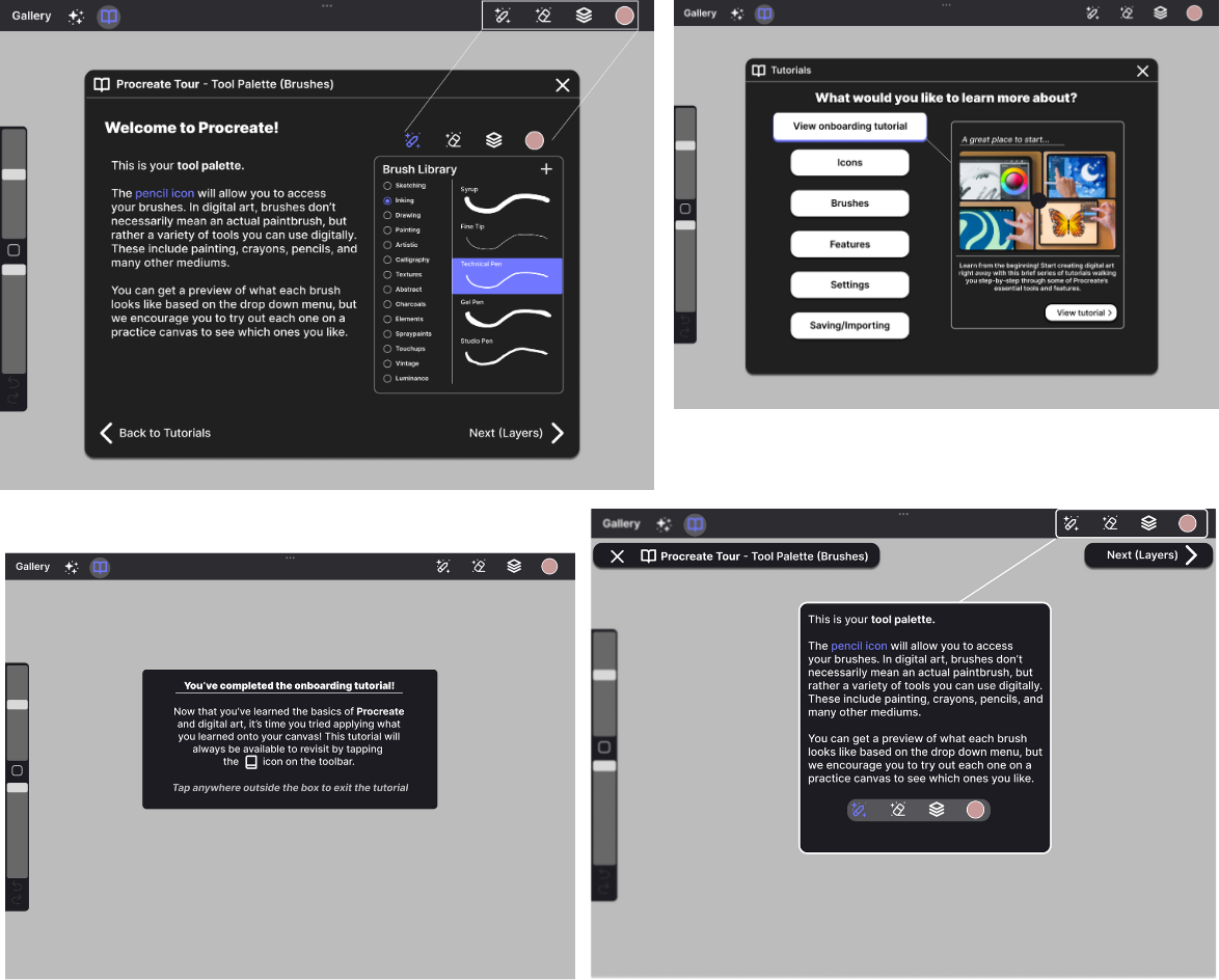
After getting an idea of what works and what doesn’t, we decided to create a simple set of wireframes based on our additions/changes to Procreate. Specifically, we were focusing on tackling the accessibility issues for both beginner and advanced users of Procreate. We did so by establishing an entry point for fresh users, where they are prompted to provide their experience level with creative applications. After this, we introduced a revamped and new tutorial system in a couple of different formats.
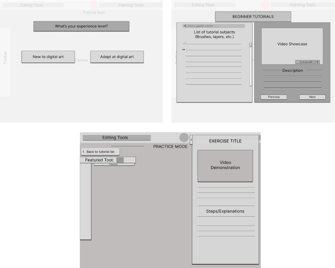
Critique
With our wireframes created, I gathered the interviewees from our initial research and had them review the designs to get a sense of what we were aiming to accomplish with the redesign. Through open-ended questions, we gained valuable insights into what could be adjusted for our final recreation of Procreate. For example, one interviewee stated, “I feel like there should also be an option to completely skip the tutorial at this prompt. It would be more convenient for people who don't want to see the tutorial entirely,” when discussing the tutorial screen. Another mentioned, “This is an interesting idea, but I feel like it's somewhat too involved and restrictive; I feel as if the fundamentals of digital art programs are easy enough to grasp without having this practice feature,” when presented with the practice screen. These comments helped guide us in the right direction for our high-fidelity prototype, where we took the provided critique and applied it.
Getting detailed
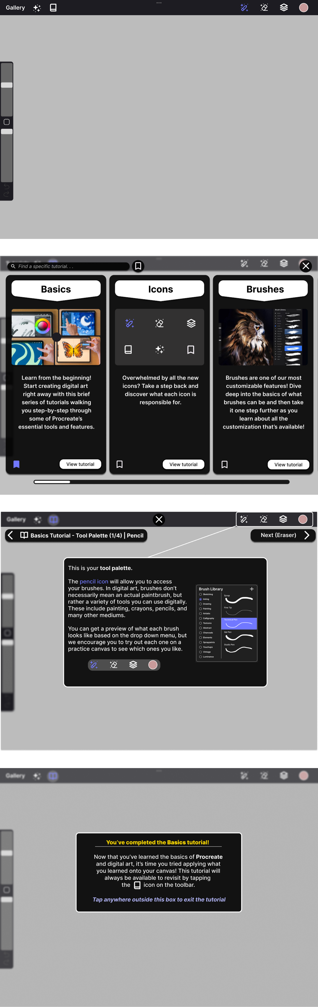
Once we had an idea of what worked for our wireframe and what didn't, we created a high-fidelity prototype that takes into account our interviewees' likes and dislikes with our creation and adapts the product to the best of our ability, along with making some additional additions that we believed would be beneficial.
Final Touches
Now that we had made our wireframes into high-fidelity prototypes, I once again took them to our interviewees to get an idea of what it was they liked and what they didn't. The interviewees enjoyed the updated looks and particularly pointed out that they enjoyed the changes we made to facilitate user freedom. We also presented them with alternate screens for the tutorial opening screen as well as the brush tutorial screen in order to have a glimpse as to which our users preferred. They enjoyed the large amount of space they took up and saw potential in its shape for a potential bookmarks feature, which we noted as a significant remark. The concept could further aid us in our goal of streamlining the overwhelming amount of features that art software offers.
From the user testing and subsequent feedback, what we wanted to prioritize was user freedom and the presentation of the information being taught. Our interviewees had different tastes in what they believed was important vs. what was not. For example, one interviewee really disliked the idea of tutorials overall and insisted on their removal, whilst another interviewee had an appreciation for not only the tutorials, but also the in-your-face implementation of them. In order to reconcile these seemingly conflicting desires, we wanted to retain the overall presentation of our high-fidelity prototype whilst incorporating navigation features such as a clear exit button, search bar, and bookmark filter. Alongside this, we wanted to take into account the issue of emphasis and contrast regarding the tutorial screens. In order to keep the designs consistent with the original Procreate aesthetic, whilst also not being overly intrusive in presentation, our final designs have a strong blur effect present for UI elements that are not a part of the Tutorial interface. With these changes, we hoped to streamline user knowledge and help them have a smoother experience, both learning and accessing the features that Procreate has to offer.
The ultimate redesign
Conclusion
Digital design applications often lack the accessibility and user-friendliness that other types of applications offer. Working toward making these applications easier to understand is likely to result in creativity being bolstered around the world. Giving people an opportunity to express their creativity more simply and intuitively is incredibly important in a world where creative work is often overshadowed by advancing technology. This Procreate redesign is just one example of how similar improvements could benefit any creative application and its users.